Tuesday, 21 December 2010


Just some shots i took at a local boat yard in stone. Something about it just appealed to me!

Monday, 20 December 2010


The last two images i produced for my Dream series exhibiton!


So last semester I wanted to produce 4 images for an exhibition being held at Stafford College. I decided document the intensley vivid dreams i suffer with most nights due to medication i have to take daily. This medications gives me dreams in which i feel a huge sense of loneliness, depression, anxiety resulting in me waking up two or even three times a night in cold sweats. I wanted to protray the cold feeling, the fear and isolation i deal with in my sleep. Its an intense experience and one i wanted to voice to other people. This is where i feel my photography is strongest, When i voice something that is personal to me or i believe in strongly. There are two other images which i will post a little later...

Tuesday, 30 November 2010

Well i have my ideas for my two responses for my brief, but i am always talking about colours and complimetary colours and wanting to add warmth and texture and a comforting atmosphere. But how do i portray this feeling through colour???
   Colour theory works by using colours that compliment other to prooke feeling and emotion. Different colours portray different emotions and feelings, such as Orange which can portray warmth or Enthisiasm, or green which portrays Freshness and peace. So working what your idea is and what you want the viewer to understand will dertermine what colours will be used in your images. As the colour examples state each colour also represent different meanings, so if you want to portray a particular idea you have to work out what colours produce the meaning you want alongside what emotions you want viewer to feel. Getting the balance right in your final image is imperitive to create the right meaning and feeling.


Example Whisky advertisements:

So i have been set an Advertisement brief as on of my semester modules. We have been given 5 catergories To choose and create a new advert for a hypothetical brand, which we will create, shoot, market and produce for the end of term. The 5 catergories are: 1. Alcohol, 2. Fast Food, 3.High Street Fashion, 4. Confectionary, 5. Coffee.
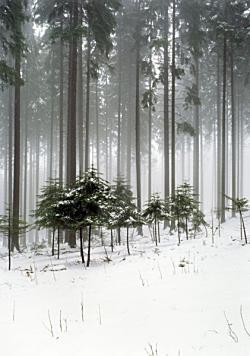
   I have chosen to focus my advert on advertising a brand of whisky aimed at the people 30 years plus of age. This age group tend to appreciate flavour, smell, brand, and rather than consuming large quantities of the liquer, they indulge for pleasure and relaxation. I want to show the high standard of the whisky as well as the quality. In the advert i want to emphasise the flavour and aromas of the spirit within a warm relaxing atmosphere. I want the viewer to imagine themselves in the situation with a glass of the whisky.
   As well as this, we have been asked to promote a negative side to the industry we choose and the advertisements within the sector. As mine is producing this wonderful whisky with which you can relax and unwind, I have decided to show a side of the industry in which people rely to heavily on the warm relaxing feeling and atmosphere that a product like this creates. The idea is that people take drinking to relax to far and become dependant, I will show in my images the effects that drinking to much has on the individual.

Friday, 22 October 2010


Documenting a nearby abandoned social services building in Stafford...

Tuesday, 21 September 2010

These Images were shot by Joel Sternfeld. I first saw these images today when in the library at University. I was shown by a friend the Book named American propects which contained around 50 images all taken over a number of years in various states in America
   What i love about these images is that You do not get the feeling of prospects from alot of these images. The colours in the images work perfectly, and the use of the decisive moment in the top left hand image of the firefighter picking a pumpkin whilst the house still burns is beautifuly done. There is a real sense of the two side of america in these images.
These images of a forest in the Czech Republic taken by Jana Hitzlova I find so mesmorising, I cant seem to stop looking at them as if I were there. The mist in the first image just adds so much impact, an almost magical feel. I love how all the trees in the backround are the same, tall, straight, and almost similar distances apart it gives a surreal sense to the viewer. Its almost disconcerting but so inviting!

Monday, 20 September 2010

Warzone documentary by Simon Norfolk

When Googleing documentary photography, i decided to add the word warzone to my search criteria. I came across a photographer named Simon Norfolk. Immediately I was attracted to his images. What made them appeal to me most was the honesty in his images and the fact that they grabbed you by ur shirt and made you want to look at more. Theres no beating around the bush in these images, its told how it is and what better way to do it than photographically. The first shot is taken at an aluminium waste pond in Petkovici, Bosnia. Men and boys were taken to the banks of the river and shot. The scale of this tragic event is clearly visible. Image two is of an old aircraft on a display plinth in Afghanistan. Stood next to the aircraft is a man holding a bird of prey, whicch in the middle east is considered a sign of pride. I think this image is so strong because no matter what has happened to this man personally or his country he is still proud to walk around as who he is. A real sign of self belief, patriotism and hope. Image 3 is shot in the streets of baghdad after Iraq had been liberated. The building on the right had been so badly damaged in the fighting. Iraq seems so tired of all that had gone on over the reign of Saddam that the peace in the street makes the city of Baghdad almost seem like its finally resting. I really took to these images. On the news or in the papers situations that these images represent are usually not entirely correct nor display the extentof wht is happening accurately where as with these images what your looking at you can feel as a human being that they are real.